Hi and welcome to my year 13 media blog! In this blog I will uploading each stage of researching and planning the productions I am going to create and then upload
Thursday, 13 November 2014
Wednesday, 12 November 2014
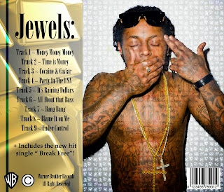
Digi Pack Mock Up
Lauren: I really like the overall look of this digi pack as it looks professional, consistent and colourful; something that would appeal to me in a music store. The main improvements I would make are the blue lines that are on each page, they seem out of place. Other than that a 4/5!
Ella: This CD package is great! It is colourful, bold, realistic and has most of the CD cover conventions. I don't like the same use of the artist on 2 of the pages as it gets a bit boring. I would rate this a 4.5/5.
Amil: This is an edgy digi pack which is nice to see as lately all I see are plain and simple ones! I like the use of the diamonds overlaid on the artist. It adds a nice effect. I don't like CD slot design as it doesn't look professionally done. I would give this a 3/5!
After receiving this feedback, I agreed with most of the comments as this is a mock up, there is plenty of time to make improvements as well as gain more skills on the software. I would give this mock up a 4/5 as the overall look displays all the conventions making it look like an actual digi pack however a few details are missing.
- Hussein
Tuesday, 11 November 2014
Tuesday, 4 November 2014
Copyright permission
Due to me and my group deciding on using a remixed song, we have asked permission from the copyright owners to use the selected tune through an email. An brief explanation of what we're going to do was given and we re-assured them that their video will not be tarnished in any way.
- Ryco
Sunday, 2 November 2014
Saturday, 1 November 2014
PLANNING SECTION
IN THE SECTION I WILL BE DISCUSSING THE PLANNING SECTION
Subscribe to:
Comments (Atom)


